
I fee like I wrote three hundred words doing this lol:


The word “Place” makes me think of the various places I’ve lived in throughout my life. My favorite place to live is by the beach and I enjoy spending my summers in a place called Bethany Beach in Delaware. For this project, I wanted to depict the culture and beauty of "The Quiet Resort" of Bethany Beach as much as possible. I thought about the ocean waves hitting the sand, the local shops and restaurants, and the seagulls flying over the boardwalk. When thinking about these subjects as a final drawing, I could not see how the viewer would know that this was a special place and not just any beach.
To solve this problem I decided to draw a unique landmark of the town. I chose the totem pole permanently displayed at the town's entrance depicting “Chief Little Owl” of the Nanticoke Indian Tribe. It was carved by, Peter Toth, who created the town’s first “Whispering Giant” and has erected totem poles in all 50 states. The goal of his nationwide project has been to create unity among all people. I believe that this statue not only reflects the culture and values of Bethany Beach, but that of all America.
This new "Whispering Giant" is carved from a single red cedar log from Alaska, which Toth selected personally. This wood is expected to last from 50 to 100 years. The salt air and wind off the ocean slowly weathers the giant adding to the feeling of history and character in the old chief’s face. I tried to capture that feeling and aesthetic value in my drawing. I focused on the textures and range of light value in the dry old red wood. The statue had to be sharp and crisp to show the detailed features of the carving. Using a blurry and more abstract background I further enhanced the vivid effect I was looking for. Since this beach is on the East coast I have the sun rising out over the ocean behind the carved giant. I played with a negative effect in the background to portray the sunrays as they break out above the clouds.The struggles I had with this piece stem from the necessity of having to travel while working on it. I was unable to use the larger paper and charcoal that I had been using for my previous projects. I think a larger drawing in charcoal would have been more captivating and better represent the concepts involved. However, one benefit of the size I did work with is being able to scan the image and send it to the company I worked for in Bethany Beach, with the intention of having prints made and sold in their stores. Thus, in addition to my immediate audience, which includes my classmates, professors, friends, and family, I hope to expand my audience to the locals and tourists of Bethany Beach. When we critique this project I want to see if the class prefers the subject matter better than the more typical cliché beach scenes and whether my imagery is "immediately pleasing to the eye".

Artist and designer Dan Caron of DC Art & Design, has influenced my work greatly. He does everything from custom artwork, web site design, company logos, professional portraits and fantasy artwork, to computer-generated graphics. As an artist he believes, “The best designs or portraits are immediately pleasing to the eye. They don't need to be explained. The image expresses much more than words can say. Although the reasons for designing a web site, a corporate logo, or even a portrait may differ, the end results should be very well designed, while serving an effective purpose. The ability to come up with an image which is immediately pleasing to the eye is my passion." I particularly enjoy the details, quality, and shading values of his "Girl on the Beach". His range of talent and skill has inspired me try to develop a wide arsenal of my own. I love his techniques and principles in both his photorealism work and his graphic design. I believe that these traits influence me and are often reflected in my work.
The American illustrator, Tracy Sugarman, also influenced my work on this piece. He is a WWII Veteran that has illustrated hundreds of books and record covers in a career lasting over 50 years. I enjoy his drawings of the sea, with birds and boats cutting through the jutting waves. Some of my favorite works by him include Goosebury at Utah Beach, and English Channel Storm. The movement he creates with beautiful line quality and variation pulls the viewer in. He also varies the sharpness in his work to create atmosphere and depth. I try to have these qualities in my work as well.
 Here is my finished work for the protest project. I looked through many photos of people protesting, searching for a dramatic image with a pleasing visual balance. I considered using a photo taken of protesters demonstrating against a different issue and replacing the sayings on their picket signs with sayings used in the Wisconsin protest. I decided to focus on the sheer number of people at the event to help demonstrate the general importance of the situation. I found a great photo of the inside of the Capital filled so thickly with protesters that you couldn’t even see the floor. I was concerned that people would not recognize the inside of the Capital and decided to switch my focus to the area just outside the Capital. I ended up finding a great photo of the front of the Capital and the vast sea of people flooding the surroundings. I felt that this image would clearly represent the protests and that people would feel a connection to it no matter what their stance was on the issues at hand. I do have a personal opinion when it come to this bill, but I do not want to tell people what to think or try to change their beliefs with my artwork. Instead I want to inform, immortalize, and spread awareness of this major issue.
I made a lot of conscious decisions concerning my mark making, stylization, color choice, etc. I started the drawing with thin, soft and loose lines to get the general layout down. I slowly made harder, thicker lines and I feel like this process reflects the increase in complexity and intensity of the events as they unfolded. I recreated the scene in the photo with very high contrast so that the white of the capital fades into the white of the paper. I only drew the shadows in-between the windows and pillars to gain this high contrast effect and add that dramatic feeling I was looking for. I believe that these graphic stylizations will give the viewer the impression that these events are both intricate and clouded.
I feel like I was successful in reaching my goals for this project. I am satisfied with the process, layout, concept and aesthetics. My focus is clear and I was able to express what I wanted to convey to my audience. The most challenging part was deciding on what aspect to focus and what image would best represent my goal. Overall, I really enjoyed researching, ideating and creating this work. I am excited to see how the class responds. I don’t expect them to necessarily see the neutrality of the work because of the dramatic feel to it and the strong emotions relating to the bill. I want to know what the class thinks my intentions were and to get their first impressions of my work.

 I was astounded that the bill was passed at the Senate level on Wednesday the 10th. It was my understanding that they needed both parties to vote, so that there are twenty votes total. I knew that all 14 Wisconsin Senate Democrats left the state to stop the vote from taking place. So how did the bill get pass? I read an article by Fox News, "Wisconsin Senate GOP Votes to Strip State Workers of Collective Bargaining Rights." It explained how the Senate requires a quorum to take up any measures that spend money, but the Republicans split from the legislation of the proposal to curtail union rights, and a special conference committee of state lawmakers approved that bill a short time later. This is a horrible corrupt uses of the system. I makes me question why this is even possible. How did it come about that out legislative system has such loopholes and how can they be fixed? The problem is that we have to use the system to fix the system. I feel like this would just stem into a cycle of issues, only creating more in the process. This particular loop hole allowed the Republicans to pass a stripped-down version of a misconceived bill 18-1. Now the State Assembly and Gov. Walker can pass and put the bill into effect. What I want to know is what can the people of Wisconsin do about it now? How far are we going to let this go? Is this not a stepping stone? Have we cracked open a door that leads to the loss of more than just union, collective-bargaining, and worker rights? Are our civil rights in danger? Our human rights? What is certain is that the future will come, we will have to face these questions, and it is up to us to decide the answers.


The ideology I wanted to work with is the common connotation that life is a path. Life is said to be filled with “winding roads” and “bridges” that everyone has to cross. In a literal sense, we map the pathways around us using road maps. I wanted to create a road map were each path is named after major “road” or “bridge” that we “drive” through in life. For example, I used names like “Death In The Family Crossing” and “Final Exam State Bridge.” I wanted the audience to feel like they are looking at a mapping of the subject’s life and at the same time be reminded of major events in their lives. My hope is that these memories with stir up emotions that allow the audience to feel connected to the work and give each viewer a unique experience. I feel satisfied with how the work came out visually, but I am curious to see how the class will react and if they are intrigued by how I conveyed my concept.

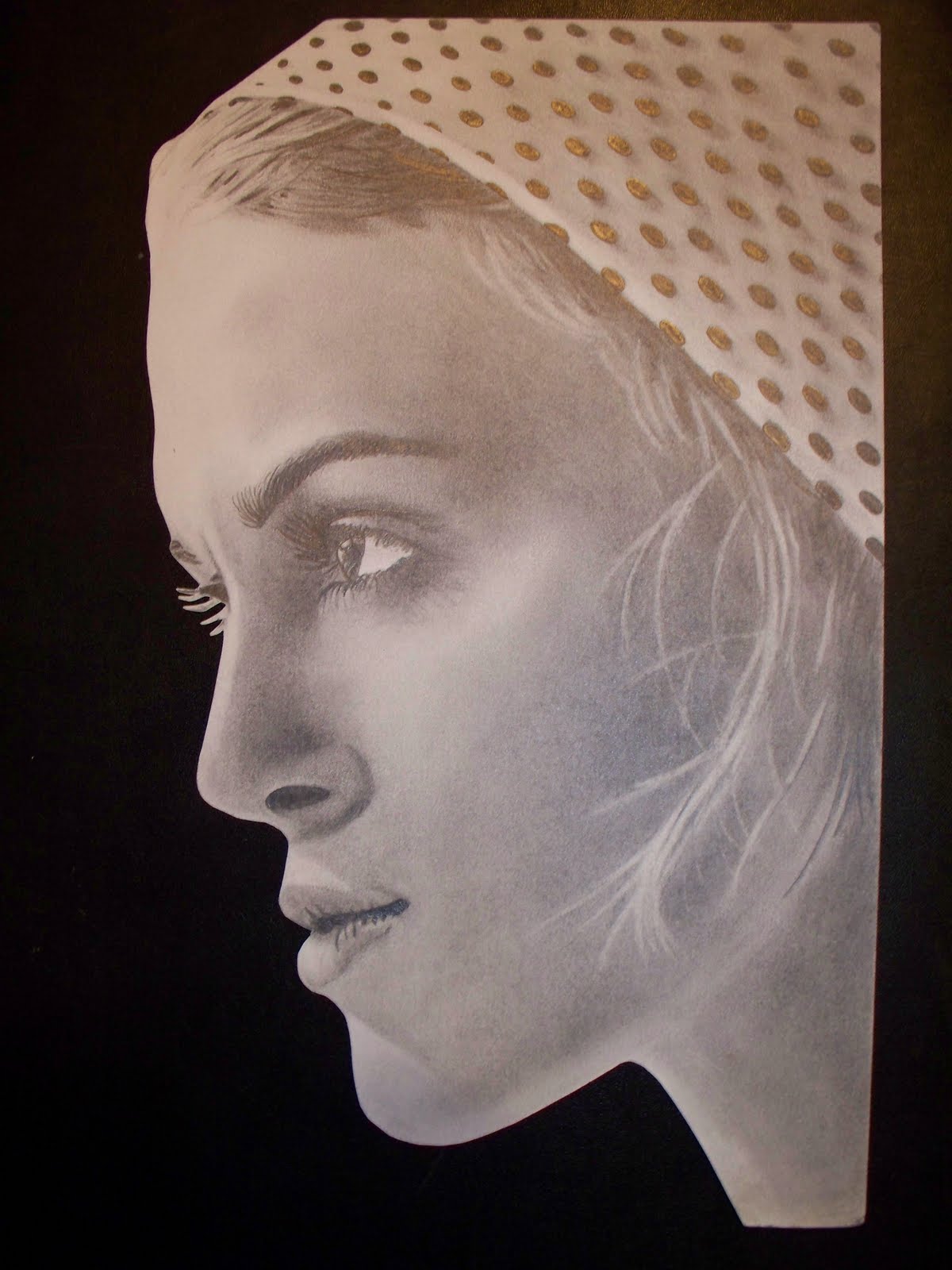
The figure is also one of my favorite subjects. I consider the face, body, and hands the most difficult, and thus satisfying subjects to draw. I love to reproduce unusual and captivating facial and body expressions. I'm sick of every photo where every person has that cheesy "Say Cheese" smile on there face. Of coarse, the beauty of a true smile is endless if you can capture it. I prefer goofy or weird expressions so that with my artwork I recreate those feelings in every viewer in some small way. I think part of the reason we both enjoy drawing faces is that there is a whole section of the brain devoted to facial recognition. This part allows babies to recognize there parents. It allows us to picture people in our mind and remember a face we haven't seen is a long time. It's the reason we see faces in ink blot test, clouds, and that bumpy ceiling stuff.
Here is a poster I made using photoshop for my 2D Digital Imaging class. The purpose of the assignment was to convey an expression, and in this case "frustration" was my subject:


The third image is a piece of map art from Vlad Studio. This is one of types of map art that I’m attracted to because of its creative and graphic qualities. The line quality and negative space gives it great aesthetics. I think that the weakness of this map is that each country is treated with the same graphic effect. There is an astonishing amount of diversity in the landscapes, wildlife, and cultures of each country. For my map art I want to express this diversity through illustrations that together make up an abstract map of the places being represented. When we get our guidelines for this assignment I will know which materials and techniques I will apply. When the piece is finished I will add a picture and a reflection in a later post. 
I am originally from Philadelphia, near King of Prussia. I spend every summer in Ocean City, MD where I manage three retail stores. I moved to Madison half way through high school, because my father, who is a famous scientist, retired and now consults for pharmaceutical companies here in Wisconsin.
I enjoy studio art in my personal life and I have entered and won a number of 2D art competitions. In one competition my work was chosen for the competition’s advertising campaign, and became the image on all the posters and cards promoting the exhibit. Growing up I found that faces and hands are the hardest things for anyone to draw, so I have always drawn them as much as possible. I usually draw photo-realistic portraits, surrealism, and tattoo designs. I tend to stick with black and white, but I also like using prismacolor pencils.
The portraits I draw are usually commissioned. I charge $50-$100 per number of people in the photo, or by hour. I draw a lot of family portraits for people to give to relatives. Occasionally, someone will want an original drawing of themselves, so I draw a lot of people’s favorite senior photo or face book profile picture. Most mother’s are actually more interested in pictures of their pets than their family, so I’ve probably drawn just as many animals as I have people.
In the fall of 2009 I earned an AS degree from UW Richland. I am now a Junior here at Stout with a concentration in Graphic Design. Despite considering myself a fine artist, I am here at Stout to learn the digital art and imaging programs so I can make a living in the advertising and design industries. 
After I earn my BFA degree, I want to go back to the east coast to Carnegie Mellon in Pittsburgh for a Masters Degree. I hope to work at a design firm creating anything from album, poster, and t-shirt artwork to web site graphics and brand identity systems.